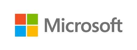
Microsoft unveils new logo after 25 years
 Microsoft today officially took the wraps off of a new company logo, the first new design in 25 years. Microsoft says the new logo is designed to show consistency between the company’s products. It features four different colored squares, which represent Microsoft products, and the Microsoft text in the company’s usual Segoe font.
The Redmond-based tech giant says that the logo will be rolling out slowly to retail stores, advertisement materials, and products.
Starting today, you’ll see the new Microsoft logo being used prominently. It will be used on Microsoft.com – the 10th most visited website in the world. It is in three of our Microsoft retail stores today (Boston, Seattle’s University Village and Bellevue, Wash.) and will shine brightly in all our stores over the next few months. It will sign off all of our television ads globally. And it will support our products across various forms of marketing. Fully implementing a change like this takes time, so there may be other instances where you will see the old logo being used for some time.
What do you think?


